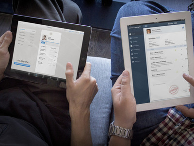
Harmony mobile payroll
Jan 2014
While spearheading the Harmony team responsible for mobile patterns, I was also responsible for integrating the two separate mobile applications for accounting and payroll. Not only was this a challenge from an IA perspective, but also from a technical and style perspective -- the two apps couldn't have started out more different. In the end, we had designs for a completely integrate universal app offering and a phased plan to releasing the work. I also got the opportunity to coach both a design intern and design associate on this project.
The problem
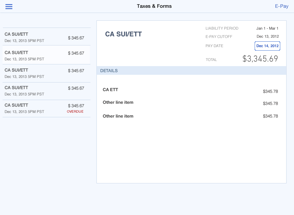
The payroll and accounting applications not only have two completely different visual styles, but they have major structural, technical, and layout differences. The goal is to integrate the two applications so that customers get a seamless experience that feels like part of one QuickBooks.
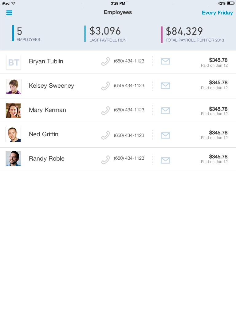
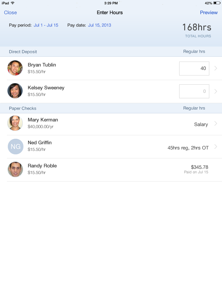
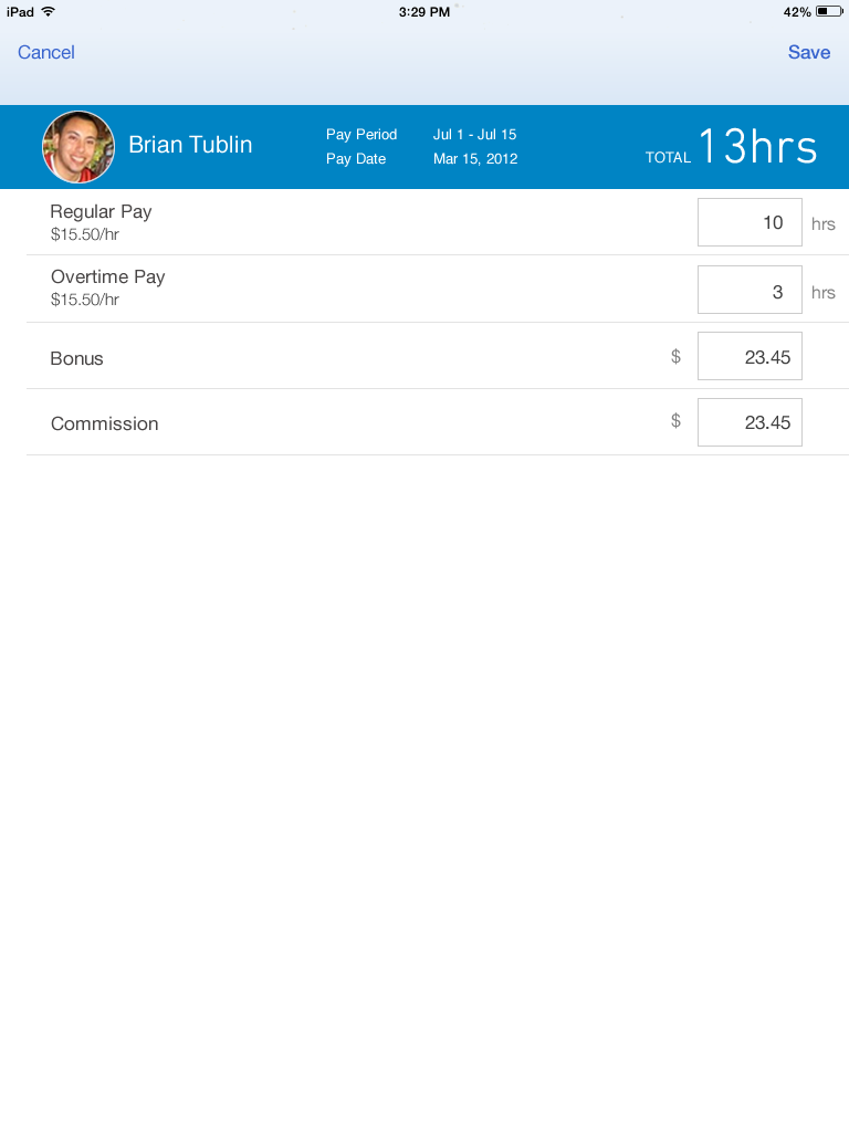
INTEGRATION WORKFLOW
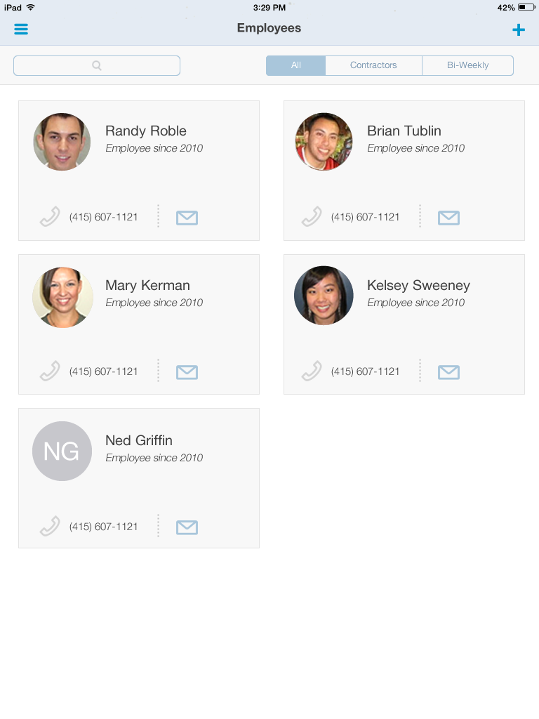
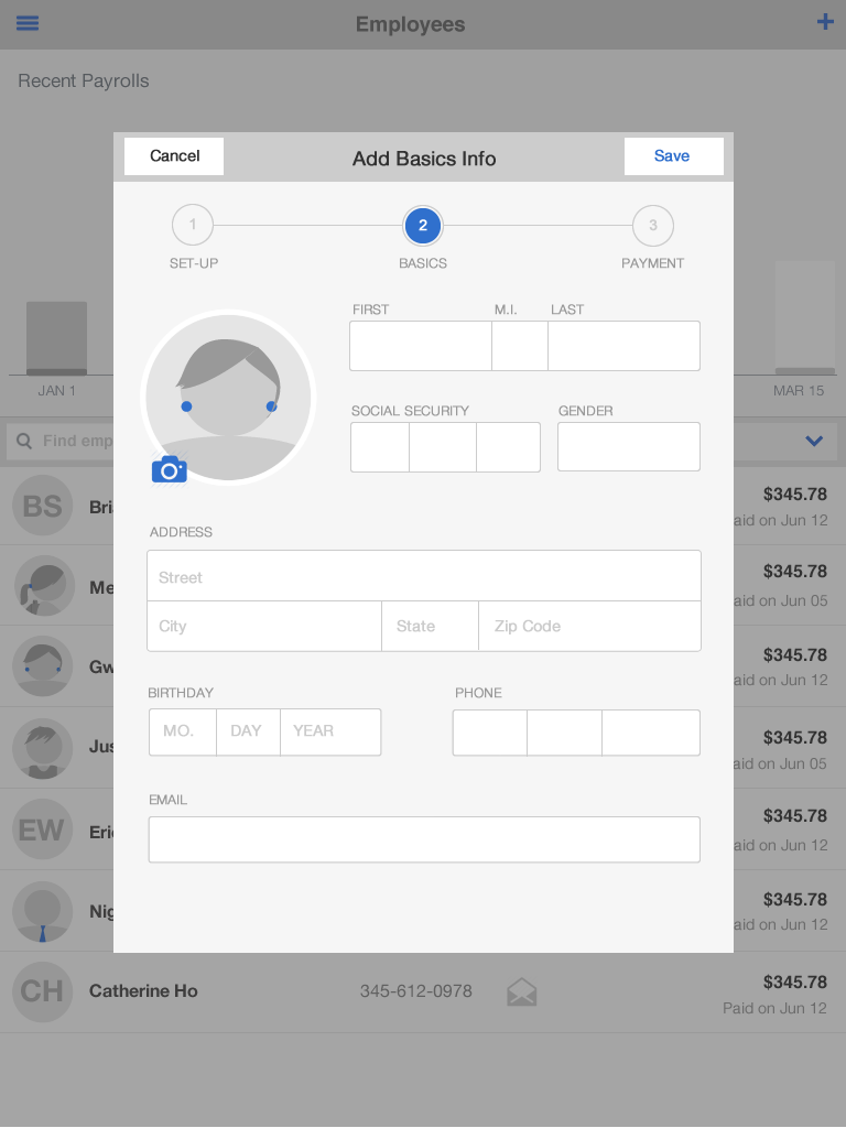
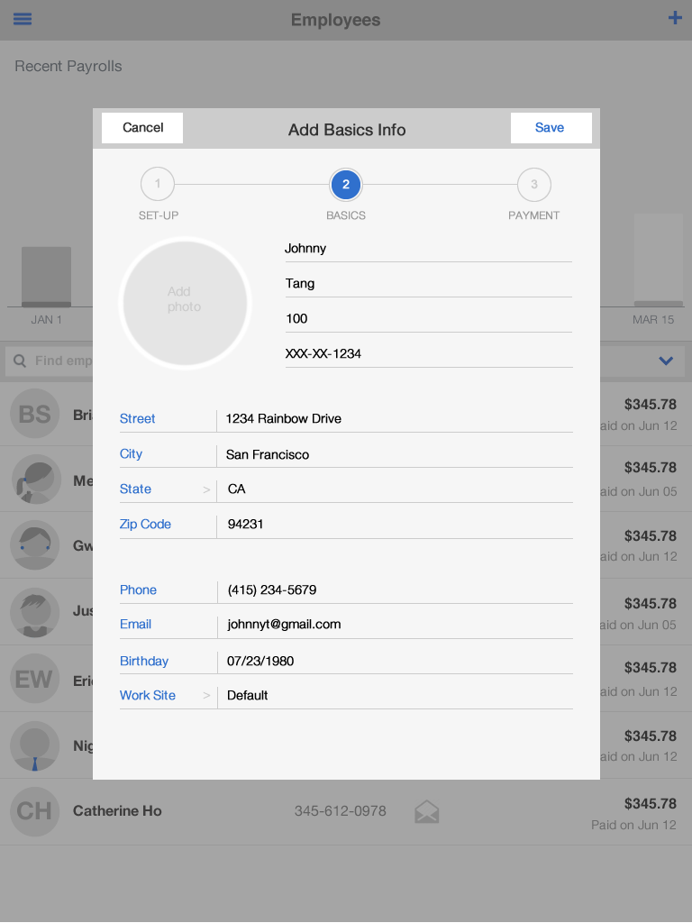
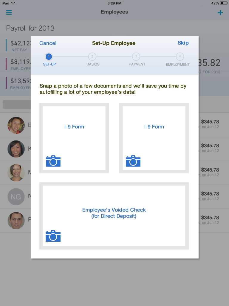
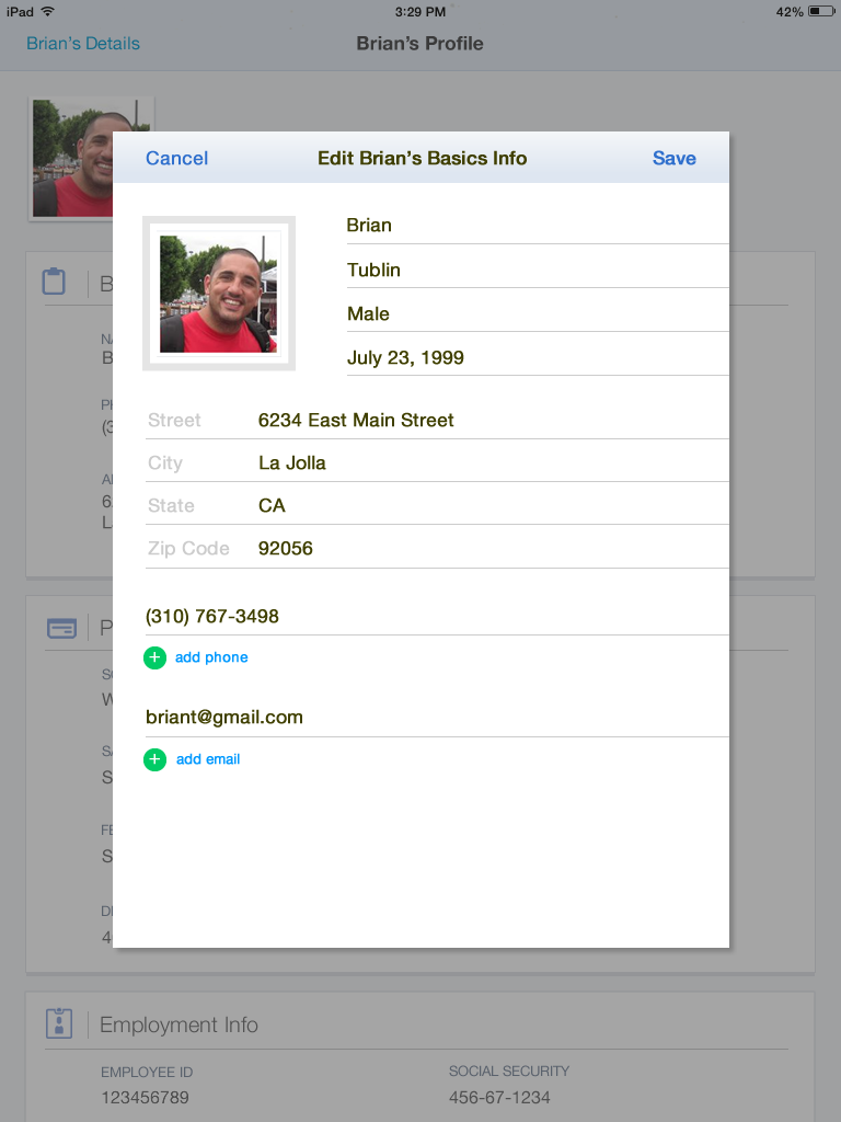
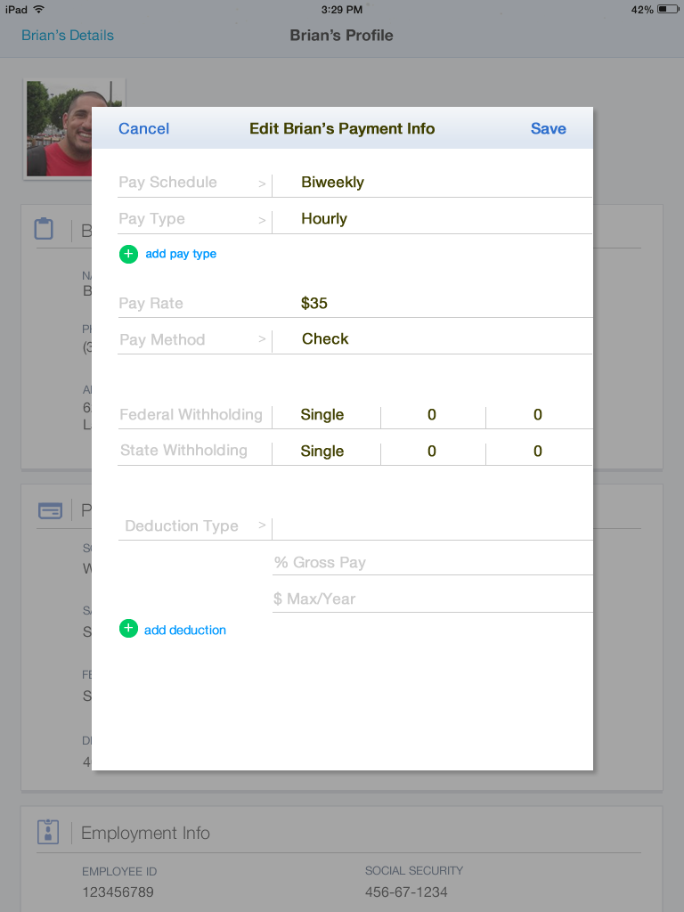
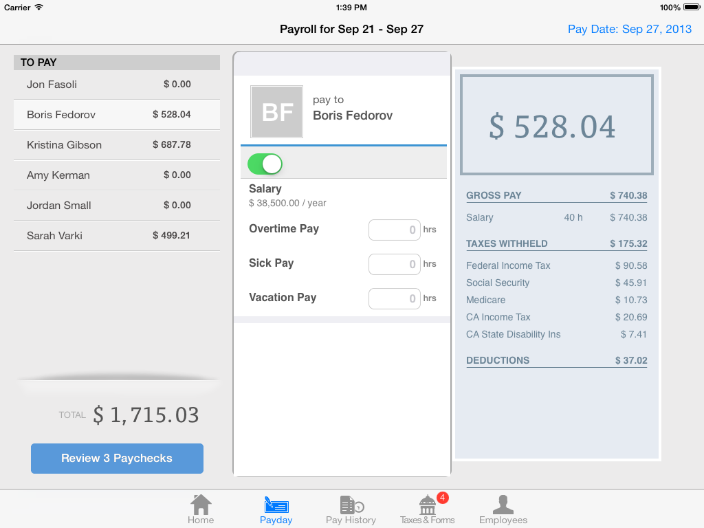
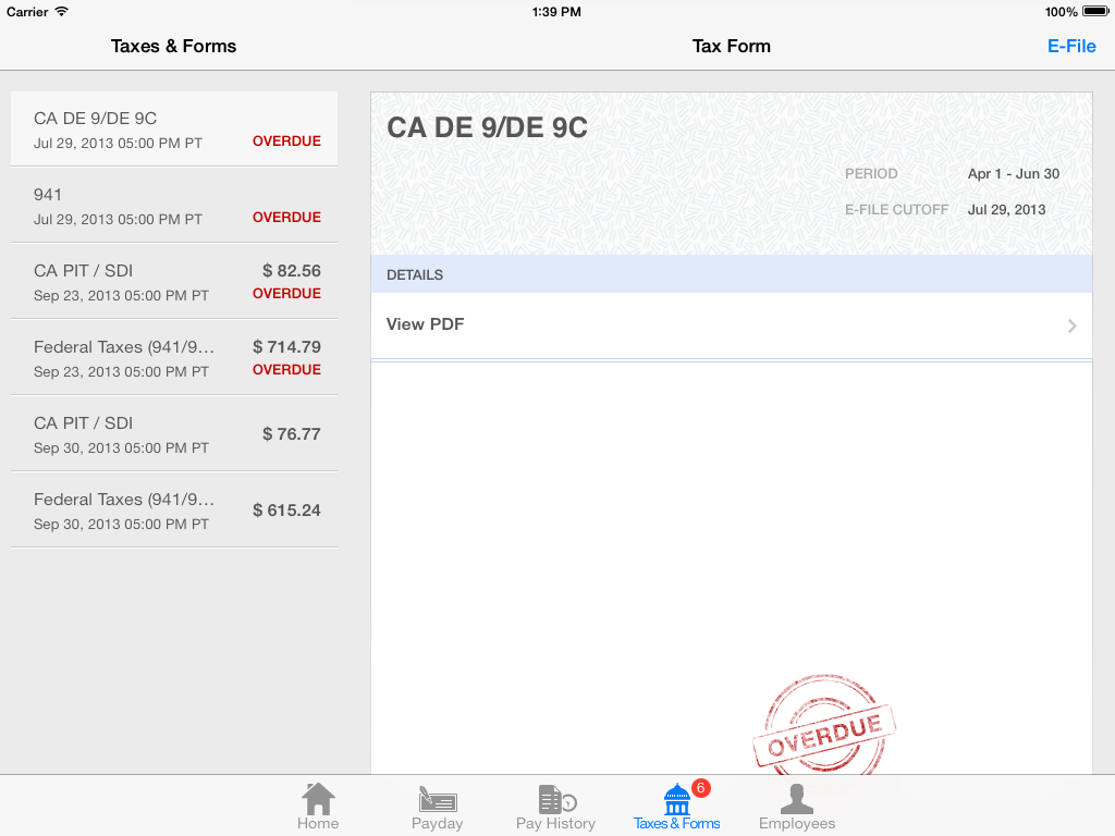
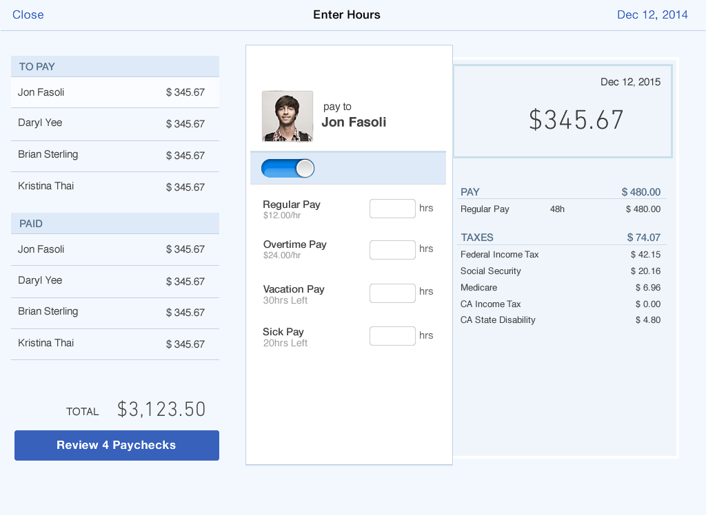
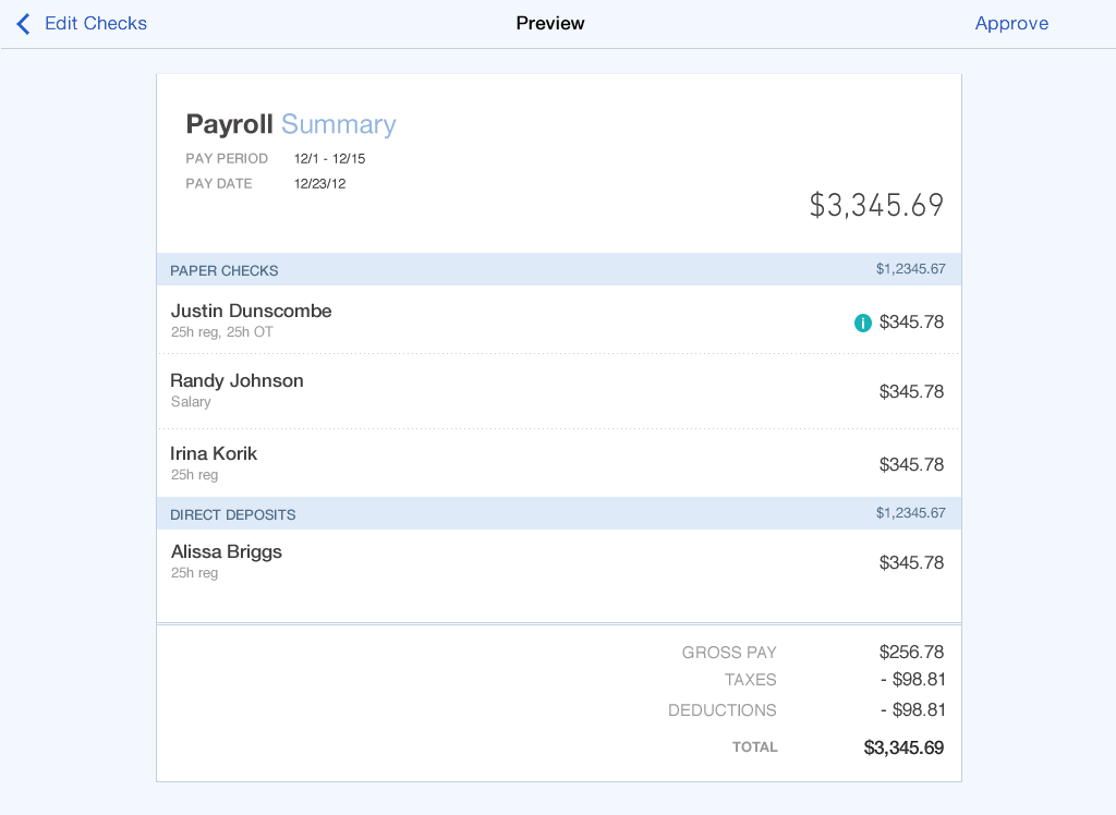
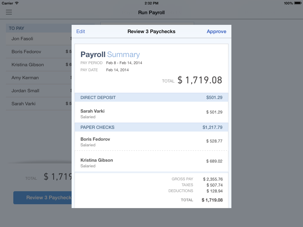
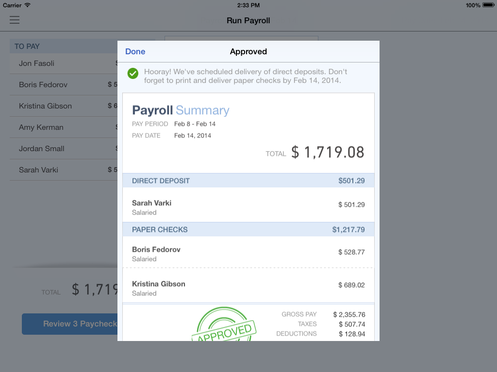
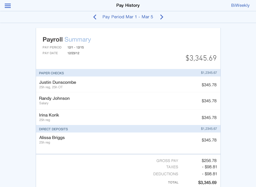
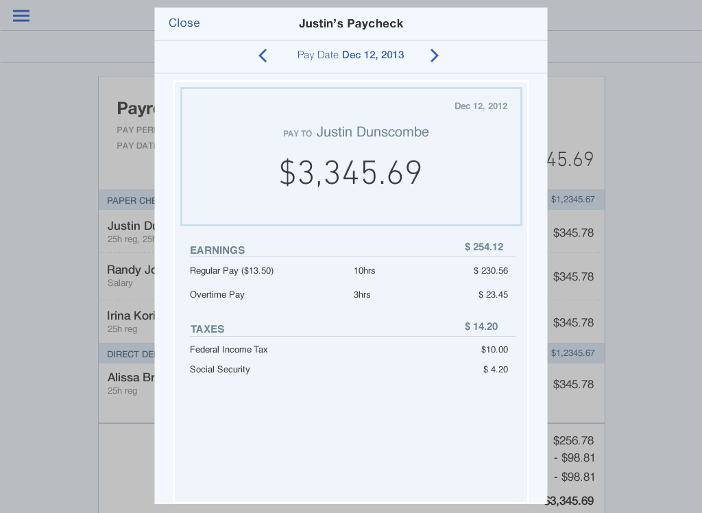
Bringing the two separate apps together was an IA nightmare. The accounting iPhone app and iPad app had different navigation structures than the web which was also different from the payroll app. I worked with cross-functional teammates to align the organization on one navigation and structured the integration accordingly. From there, we had to re-architect the primary payroll flow to work in both landscape and portrait and to follow the new Harmony guidelines.
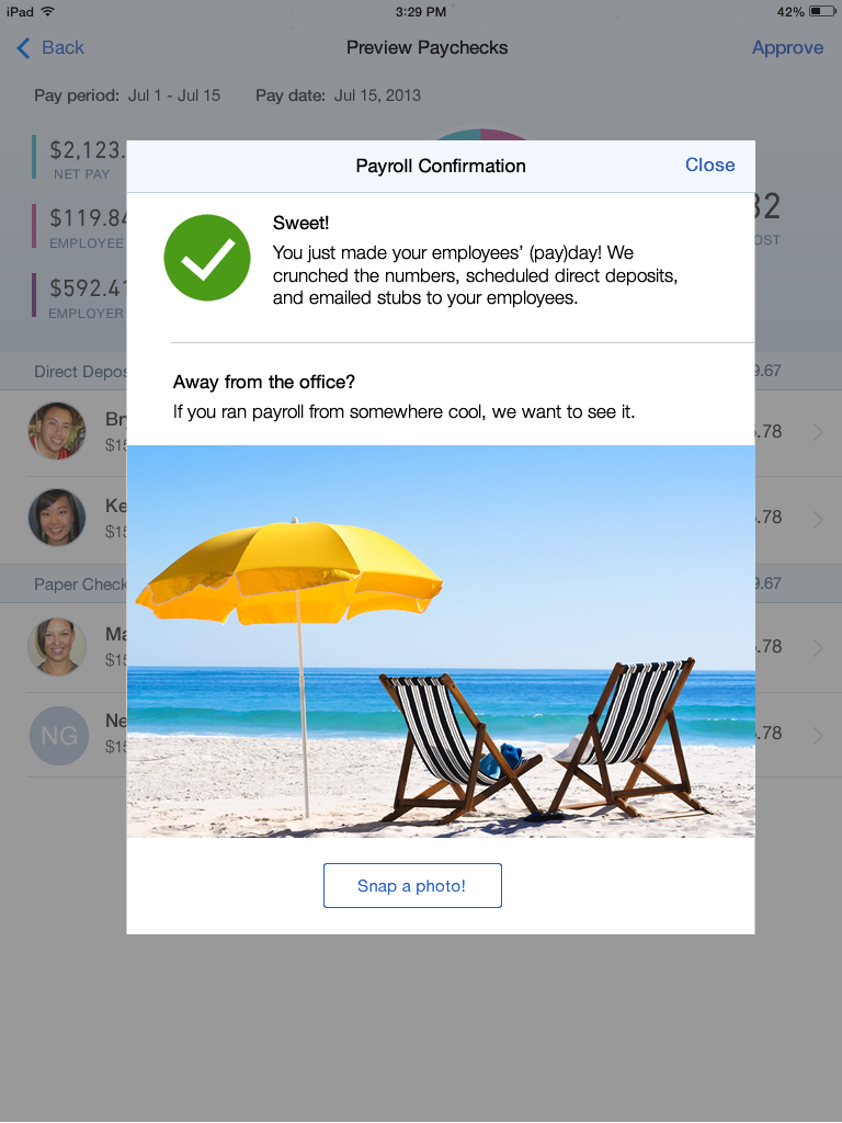
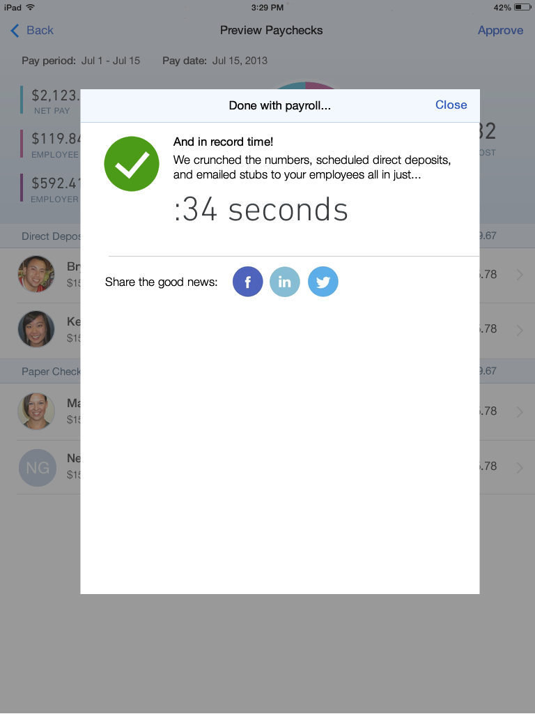
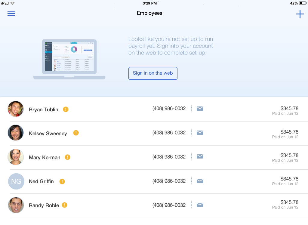
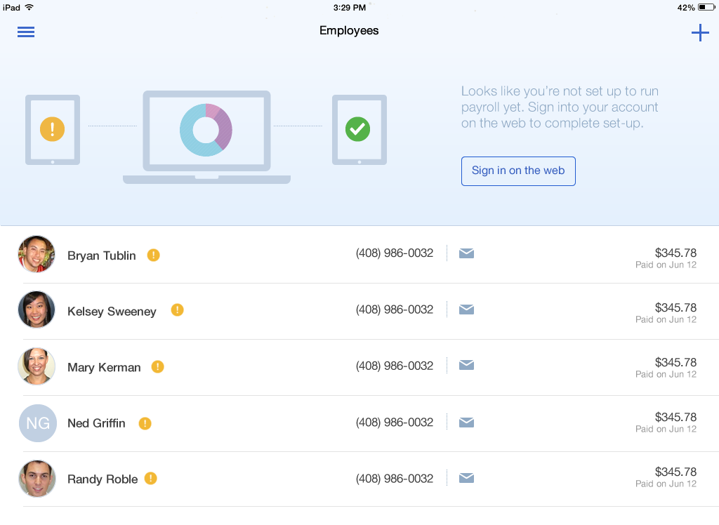
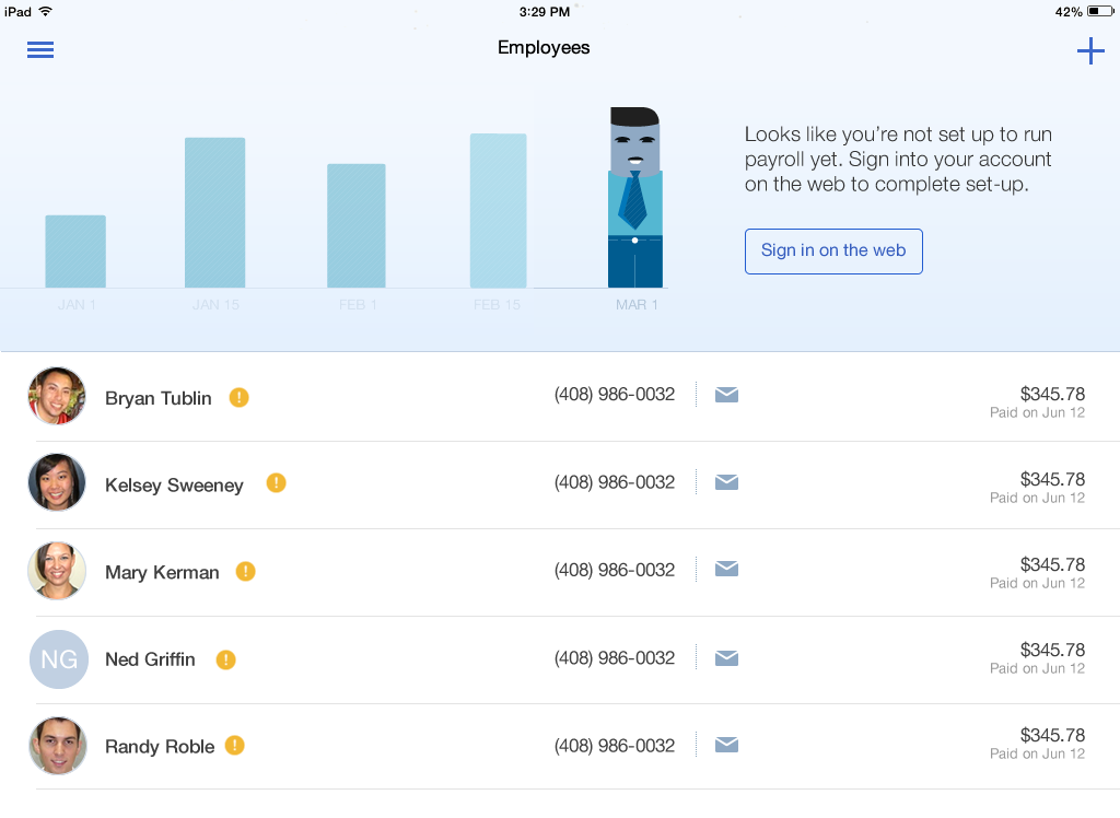
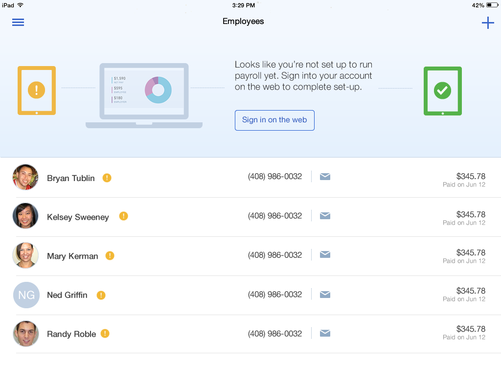
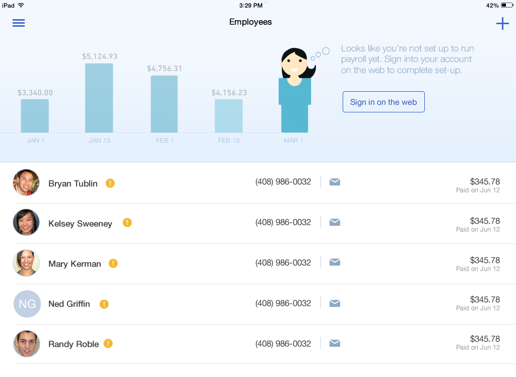
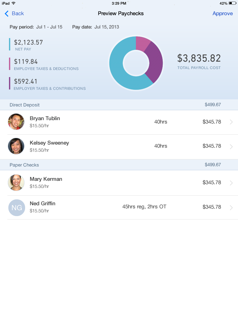
Go broad
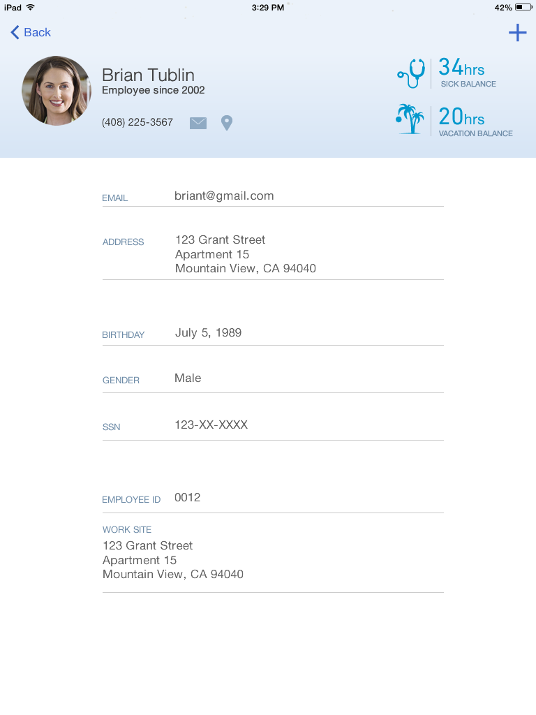
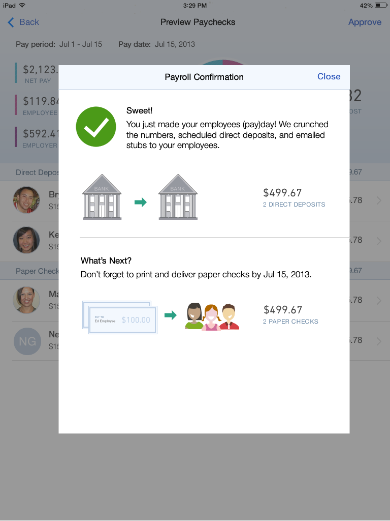
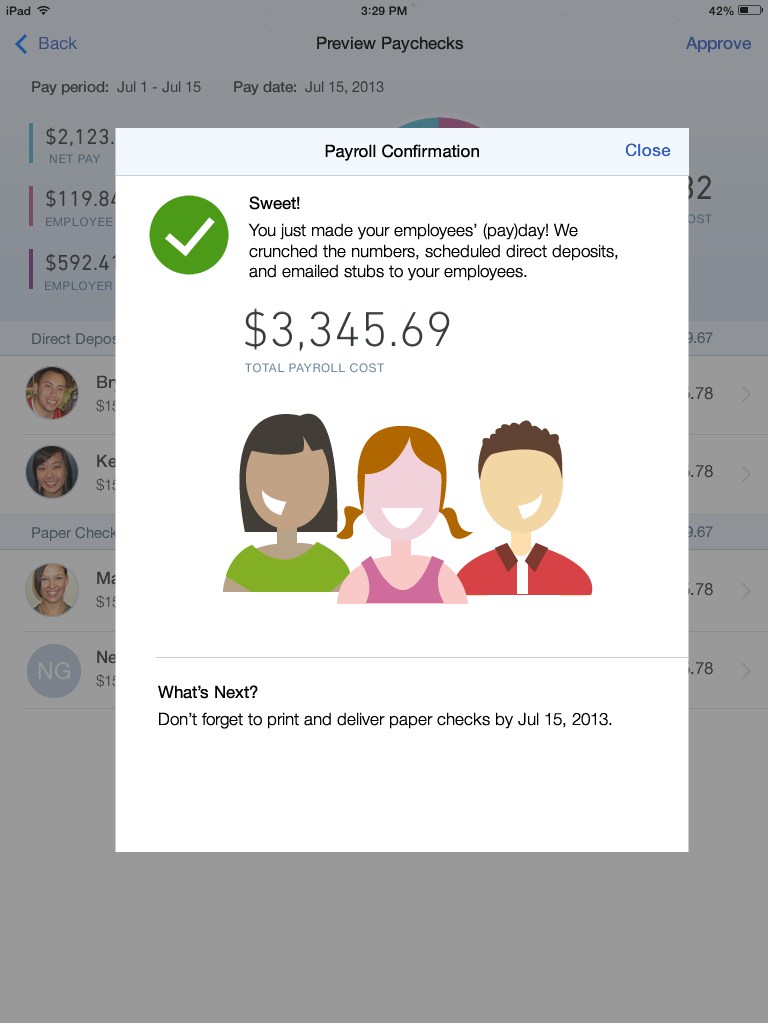
Since the primary goal of this project was to align with the new Harmony patterns and styles, I focused our design exploration efforts on a few key areas. We explored multiple concepts for data visualizations for the stage areas, we explored building an emotional connection leveraging illustrations in the empty state use cases, and we looked at confirmation messages as an opportunity to mobilize promoters to share with app with others. For this project, I coached an intern designer and associate designer who each took on some of the sub-projects below.
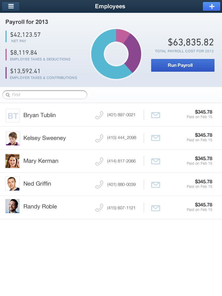

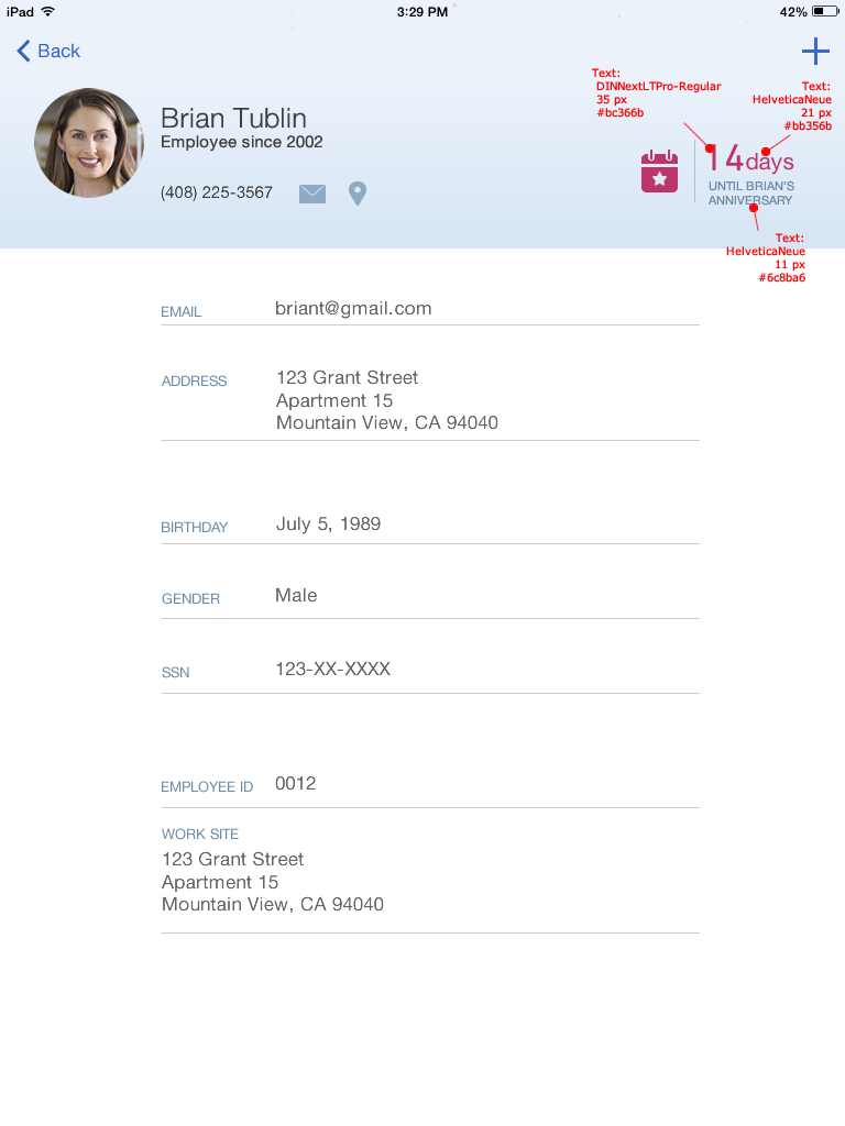

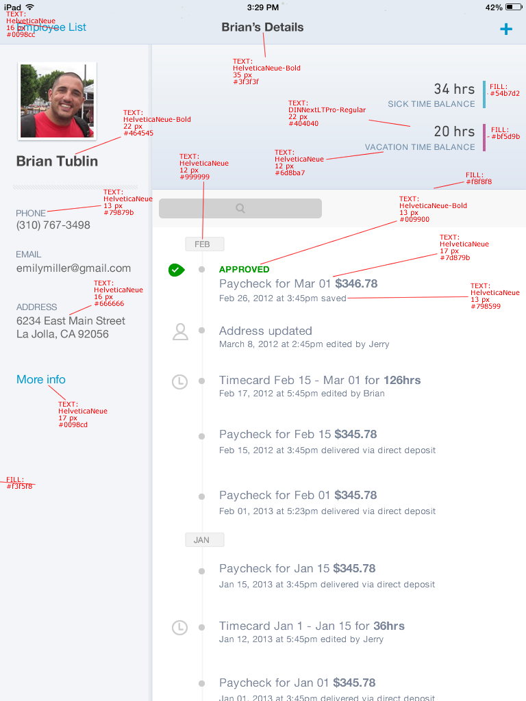
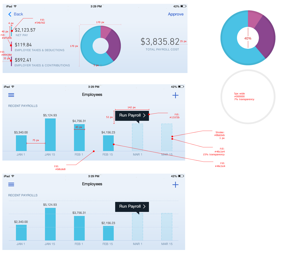
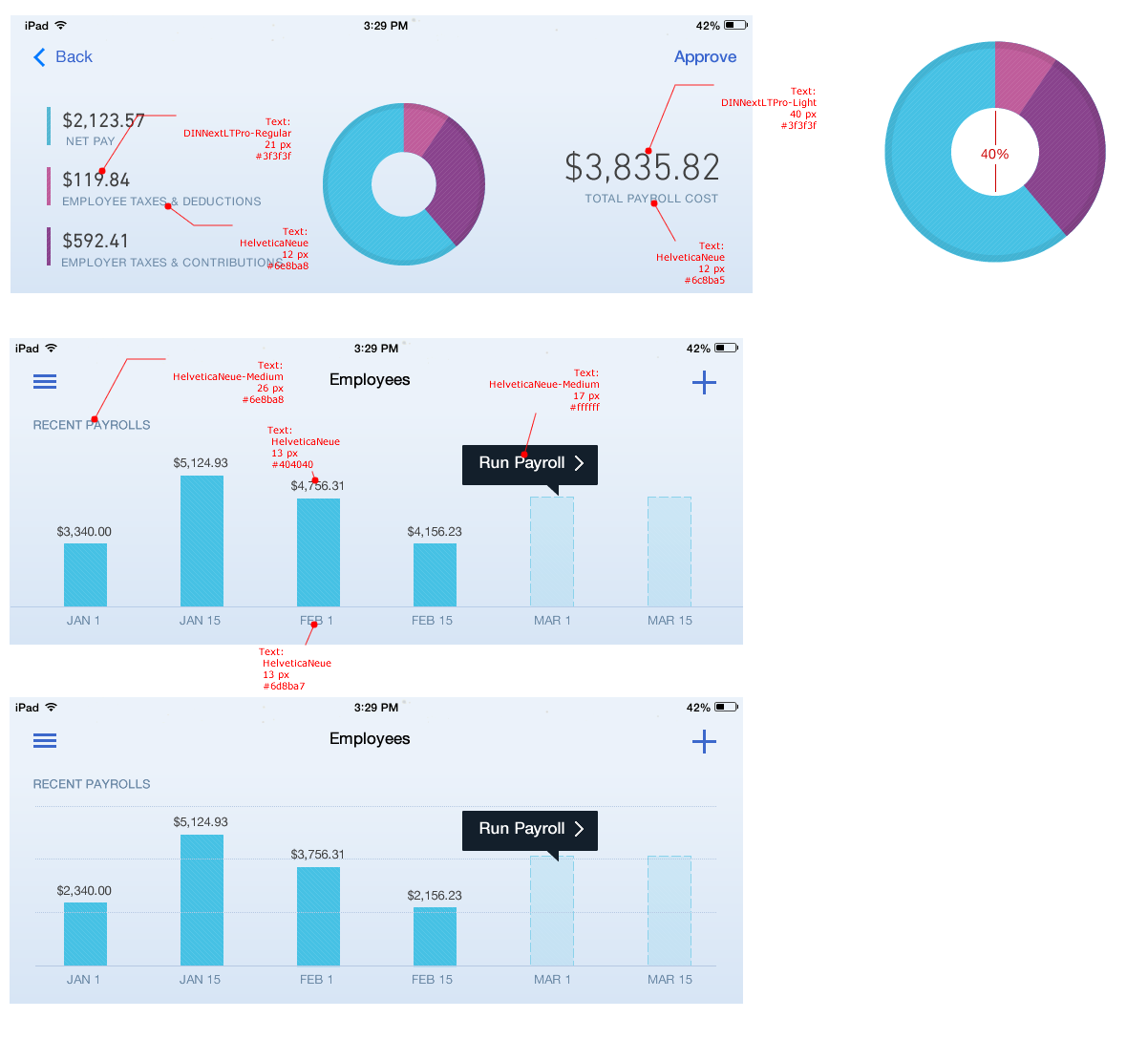
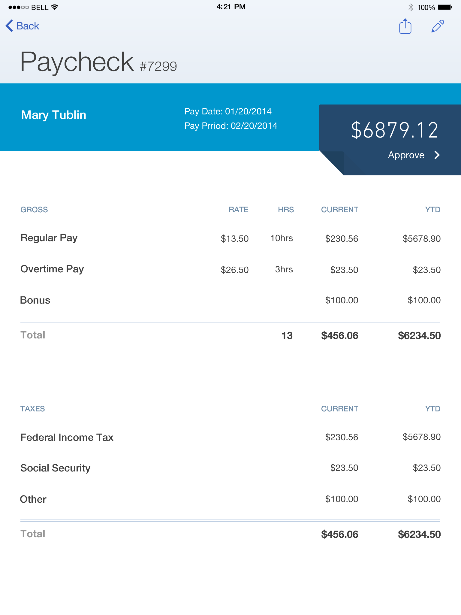
DETAILED SPECS
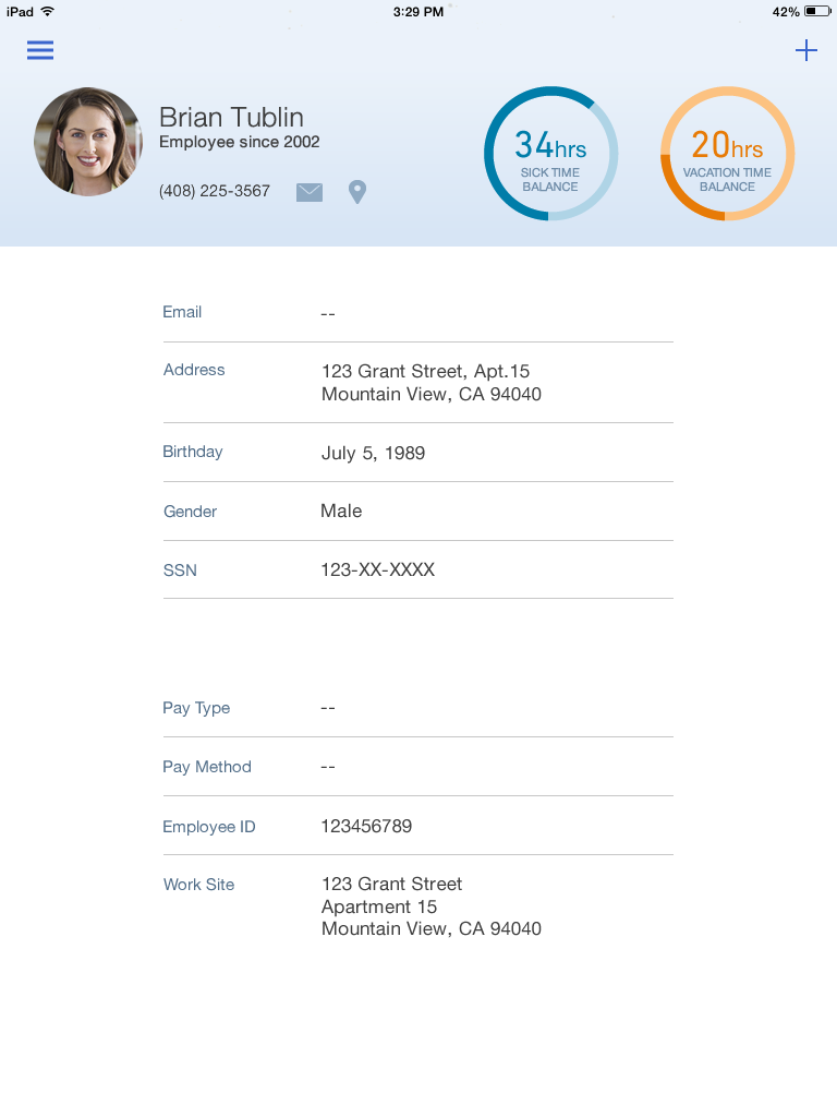
Because our dev team was short staffed, I reached out to our central development organization to get resource help with building the data visualizations. Since data visualizations hadn't been built yet on the mobile platform or in the Harmony styles, I worked closely with both dev teams to get all of the details just right. This included specifying how that elements draw into the view and what happens when the user interacts with them.
Before and after
The constant challenge with this project was aligning the organization and resources against yet another design refresh. We needed to balance the new look-and-feel with working towards increasing the app's functionality. I championed a phased approach that would allow us to continue to release functionality (without having a Frankenstein app) and make progress toward the design goal. The result was a set of color changes in phase I and then functionality and layout changes in phase II.


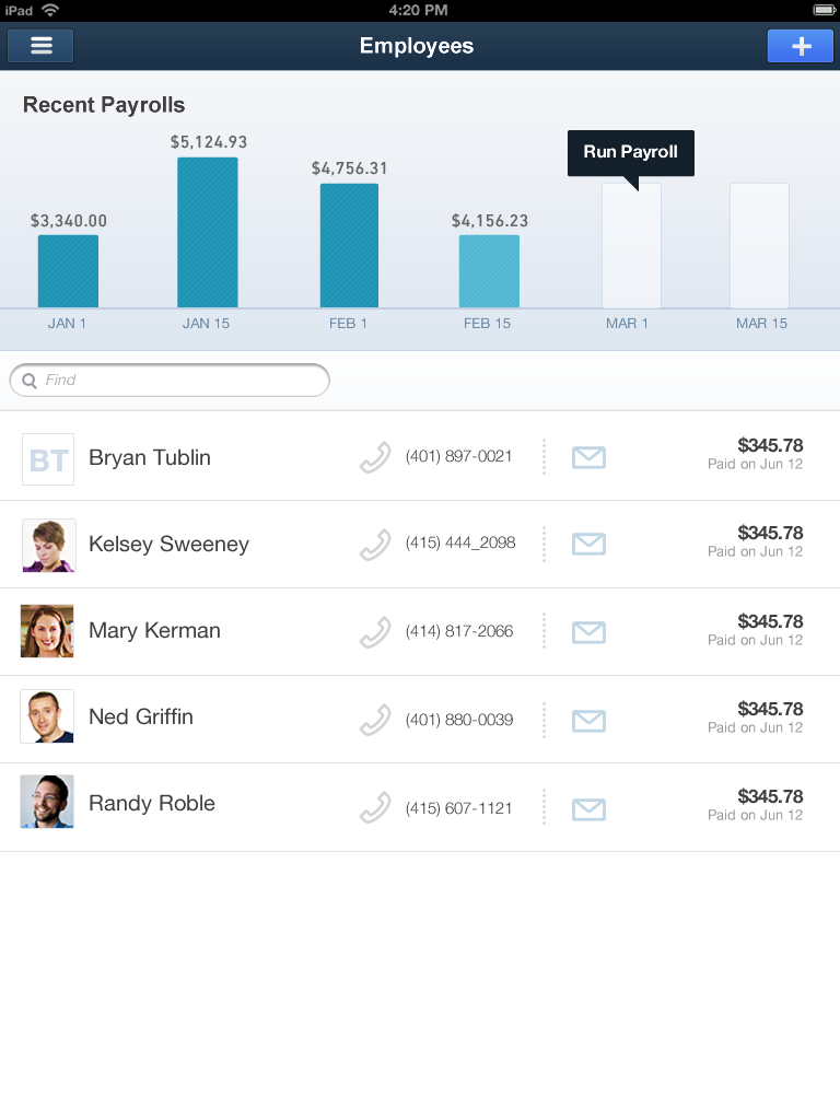
FINAL RESULT
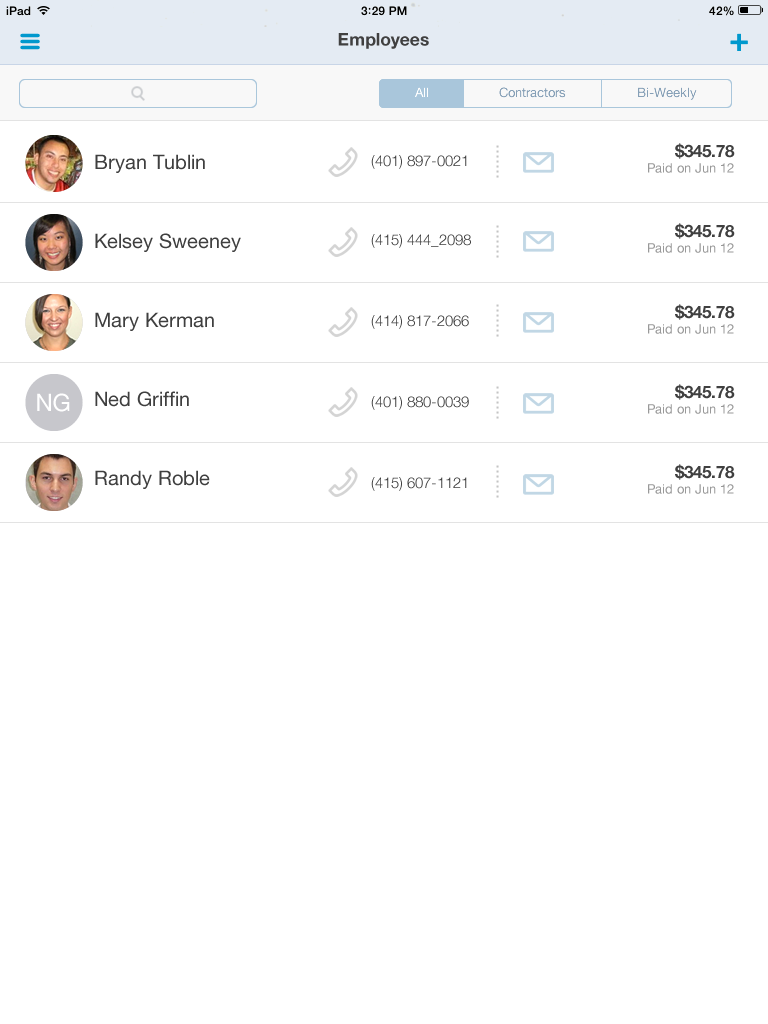
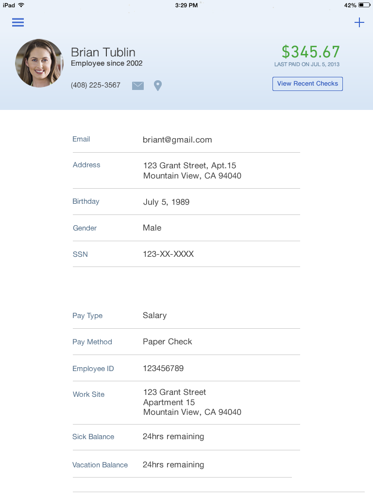
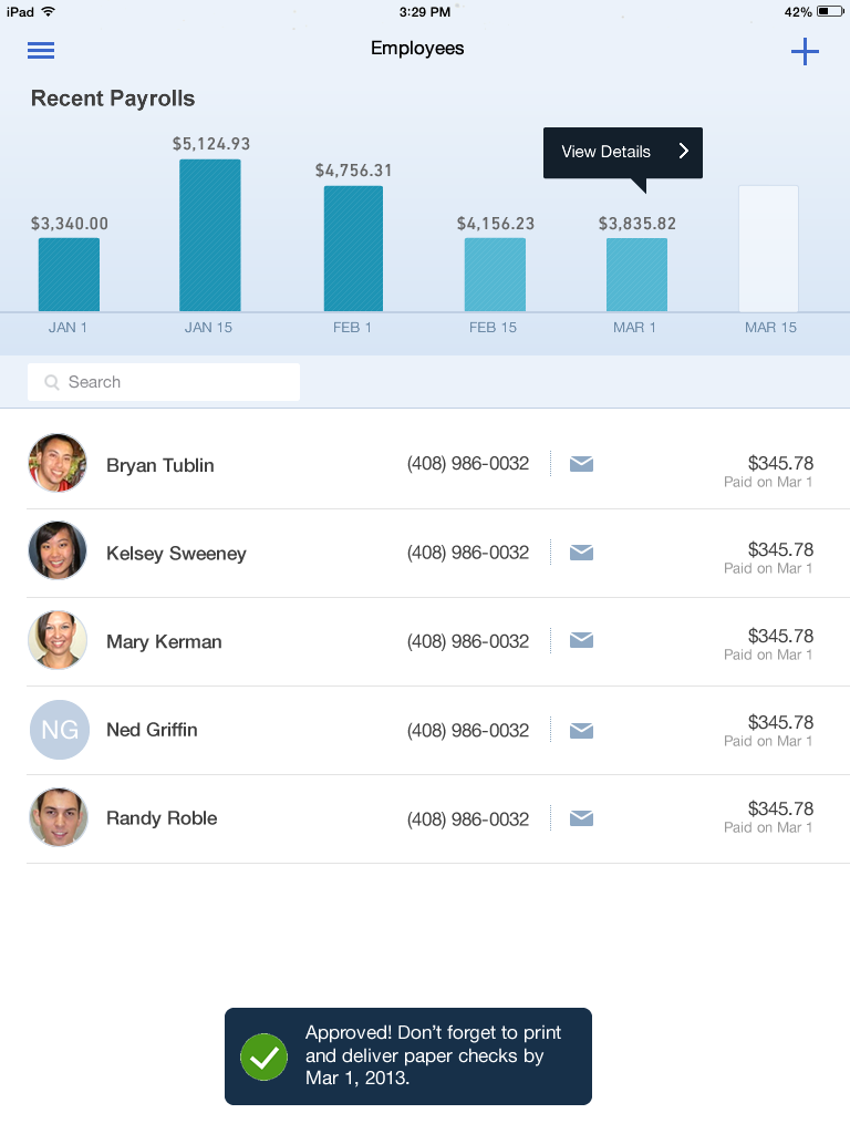
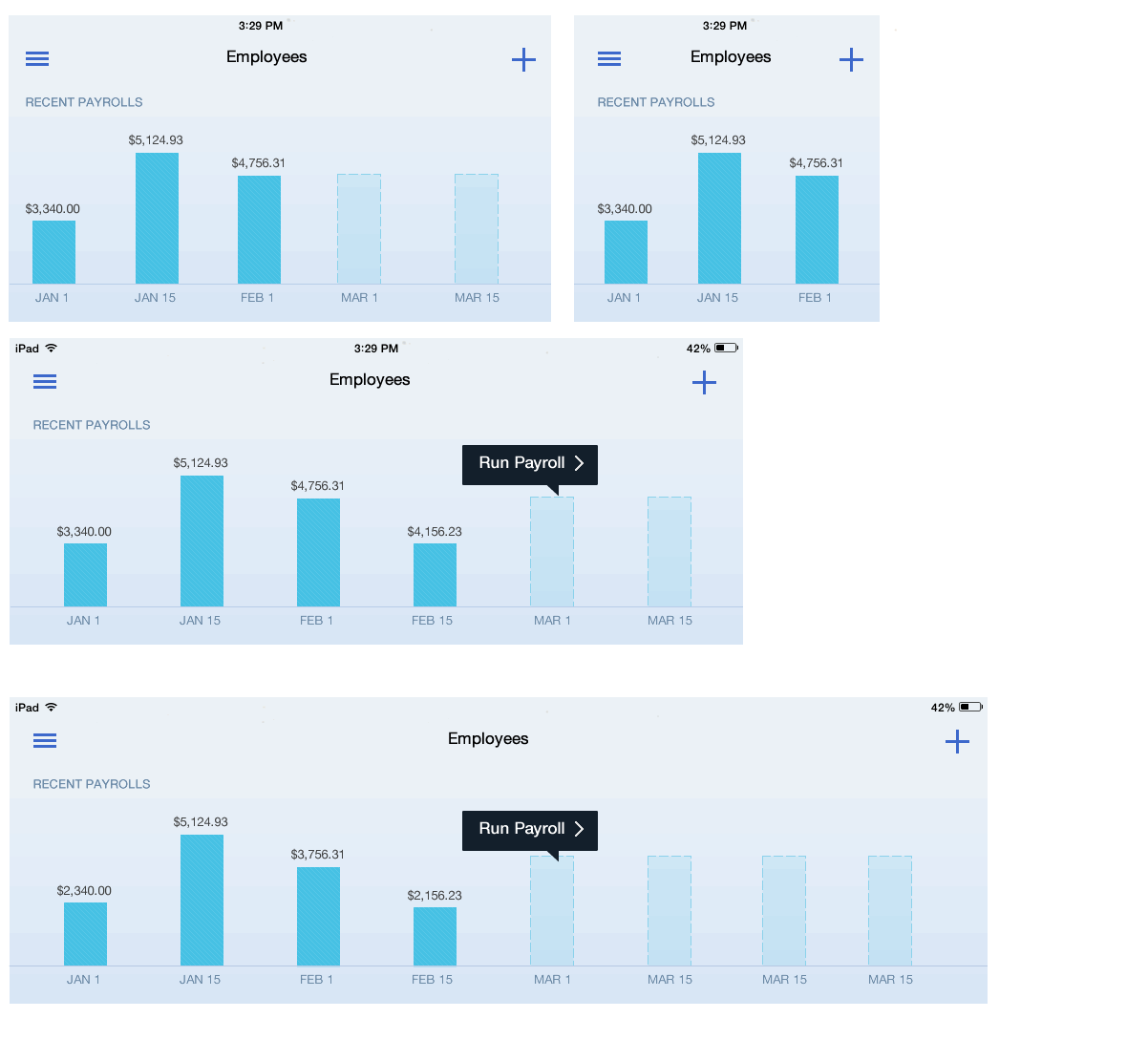
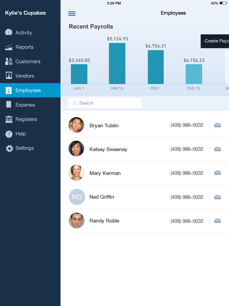
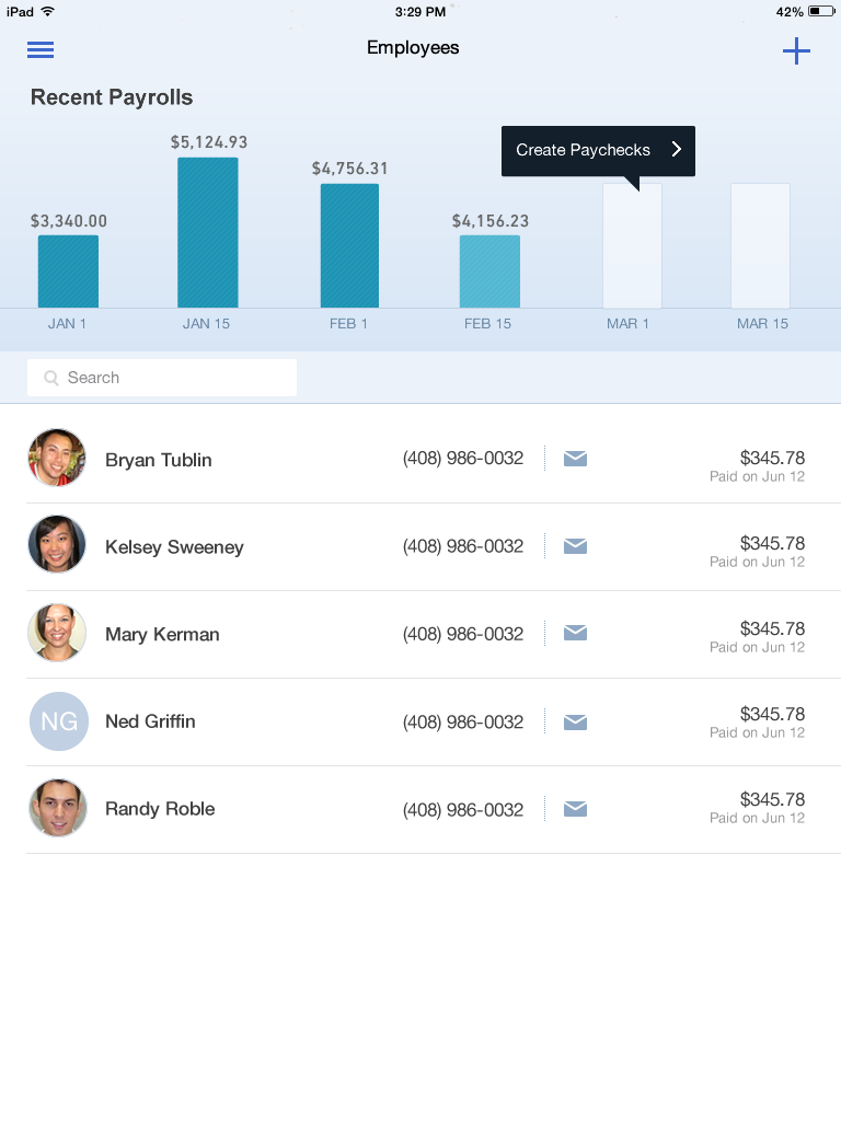
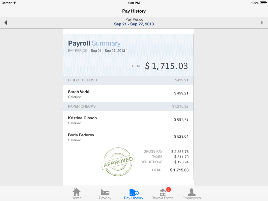
In the end, I helped align partners across both the accounting and payroll organizations to the new design and the team began executing against the phased plan. Ultimately, this project was a huge win for the overall ecosystem and we were able to sneak in some functionality that even the web app didn't have yet (like the recent payrolls bar chart)!