I’m constantly running across awesome user experiences — but I never take the time to actually document them for future reference. So I’m starting a mini-series on my blog to share some weekly UX inspiration. I hope you enjoy these little nuggets of delight as much as I do =).
1. Some conversation-worthy copy
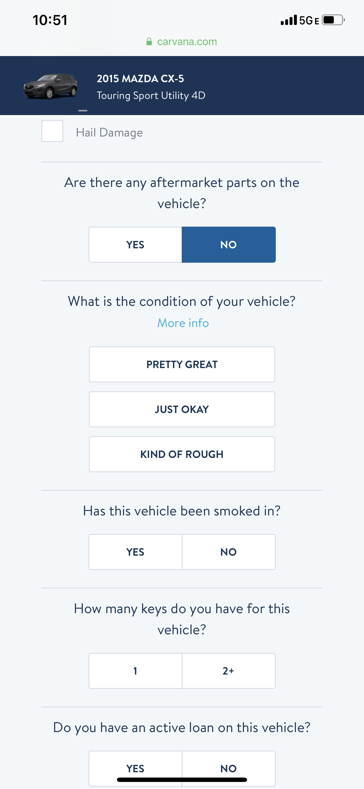
Over the weekend we were driving back from my parents house and my husband was bugging me yet again about trading in our car. This time, it came with a word-of-mouth recommendation from a colleague who had tried out Carvana and said the experience was amazing. They didn’t ask any questions, they just drove up, picked up his car and off they went! It sounded pretty magical so we decided to take the first step and at least see what my current car is worth. And low and behold, I ran across this nugget of amazing copy writing. Not only was the web-app experience super smooth and modern, but when it came down to perhaps the most challenging part (describing your vehicles condition), Carvana made it not only easy, but fun, to choose! I aspire to be able to write copy this true, honest, and hilarious someday!

2. A handy little promo!
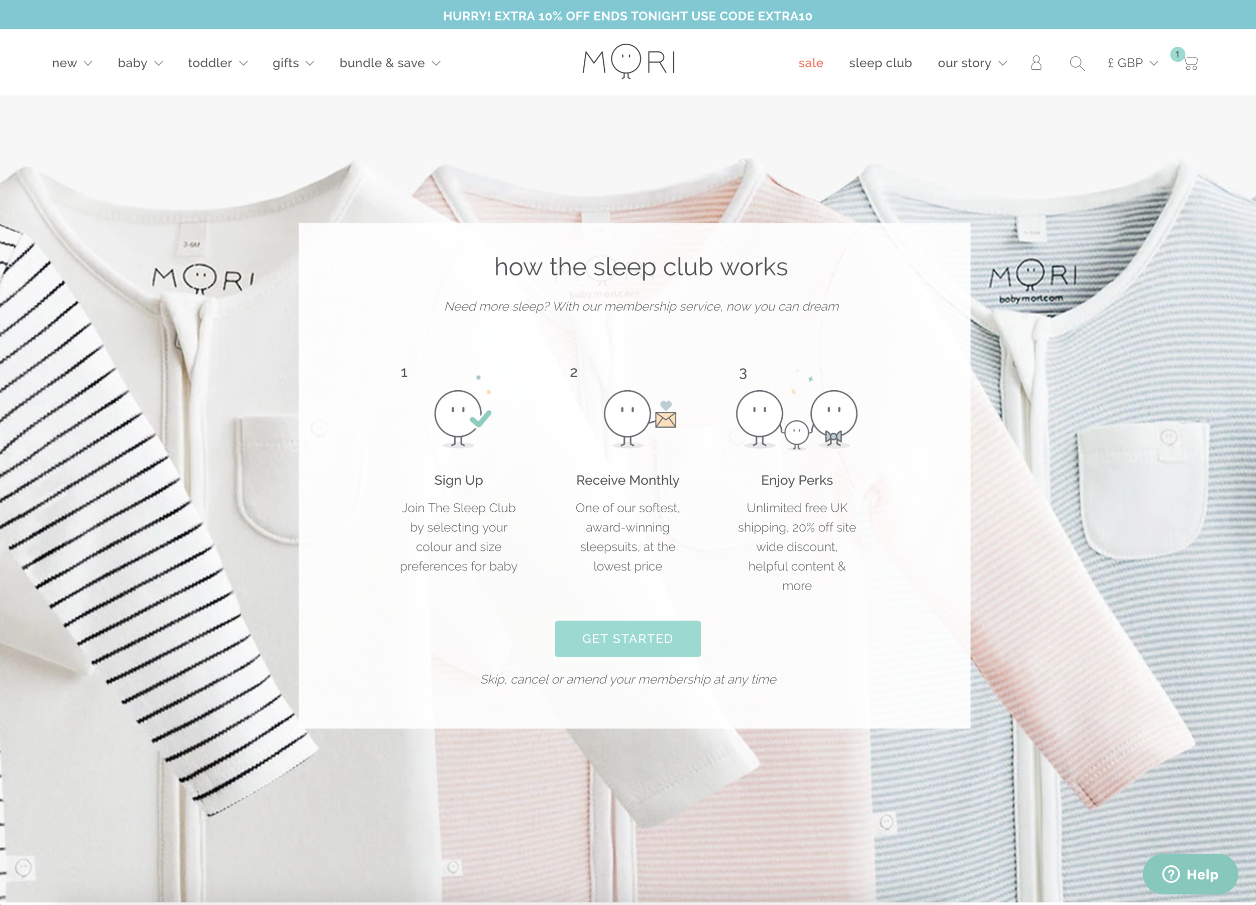
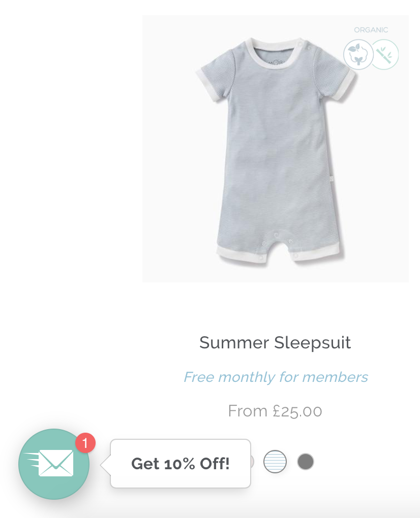
So I ran across this adorable baby clothing brand called Mori last weekend while shopping local. I decided to check out their website to grab a few more items and I just fell in love with their site experience. What could you possibly want on an-commerce site more than a sale or promo or discount code? I just loved how smooth this little plug-in to save 10% off was — it was eye catching, but it didn’t degrade the brand. Like a friendly little shop helper handing out coupons at the front of the store! And how could you not be in love with their little logo who’s eyes blink at you while you’re shopping. What a great subtle animation that brings the brand and site to life!

3. And talk about social proof…
You can tell I spent my weekend shopping for baby clothes! But how can you not love it when you’re done shopping and there’s still more rewards or coupons to be had? We’ve all gotten the endless requests to share a referral code after a purchase — and we’ve all probably thought the same thing “Are my friends going to think I’m just trying to sell them crap?” Which is quite often why I don’t participate. So I just loved how Carters is trying to encourage sharing by showing how many other people are sharing in the last 30 days. That’s definitely an application of social proof I haven’t seen before. I wonder if it’s actually working for them.

Well there you have it — some UX nuggets from this past week. If you happen across any inspiration yourself, please share! Inspiration can come from anywhere =).